Preliminary Task
Our
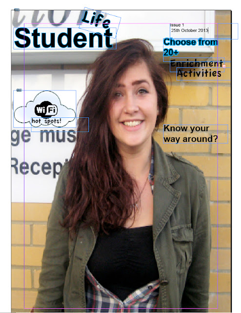
task brief was to create a student magazine; my magazine is aimed at
students studying at South Downs College aged 16-18. My magazine will cover
topics inside and out of college, the first issue will be a welcoming into the
college featuring revision tips, enrichments, know your way around, bus time
tables and various others. I decided to make my cover lines short and snappy,
including punctuation to grab the reader’s attention.
My next decision
was the Mast Head of my magazine I thought of three titles to use
Student, Student Life or SDC Weekly. Out of the three I chose Student Life
because I felt that it covered the whole aspect of being a student, other than
just the academic side. I've chosen to use bold relaxed fonts,
creating a friendly atmosphere. Such as 'Apple Boy' and 'Arial Bold'. I also
included 'Comic Sans' which is a Sans Serif Font as they're usually associated
with a younger tabloid magazine such as OK, opposed to a broadsheet
like The Times which are typically aimed at an older audience
and include a Serif font. My Mast Head has ‘student’ written in bold and
then ‘life’ hovering above slightly giving the impression that life is hanging
in the balance, due to certain decisions impacting the future.
The tagline for
my magazine is “your college survival guide”, making it an essential part of
college life. It will be published at the start of the college year, and will
feature different seasons and the articles in the magazine will also be related
to the seasons. The main image for my magazine will always be a student from
South Downs with an area of college as the background, to make it clear who the
target audience is. The magazine would be published monthly, and the size of
the magazine would be A4 sized and the colour scheme is based around the
college logo: White, black, blue and green.
Overall I’m
pleased with the layout of my magazine cover and hope my work will progress
across the course. However, I would try and improve the background of my image
by possibly taking it in front of the main college reception. Also due to technical
difficulties my contents page font is slightly different from the front cover.


